Project Brief: Design an identity system for a fictitious web designing brand called “CODESK.”
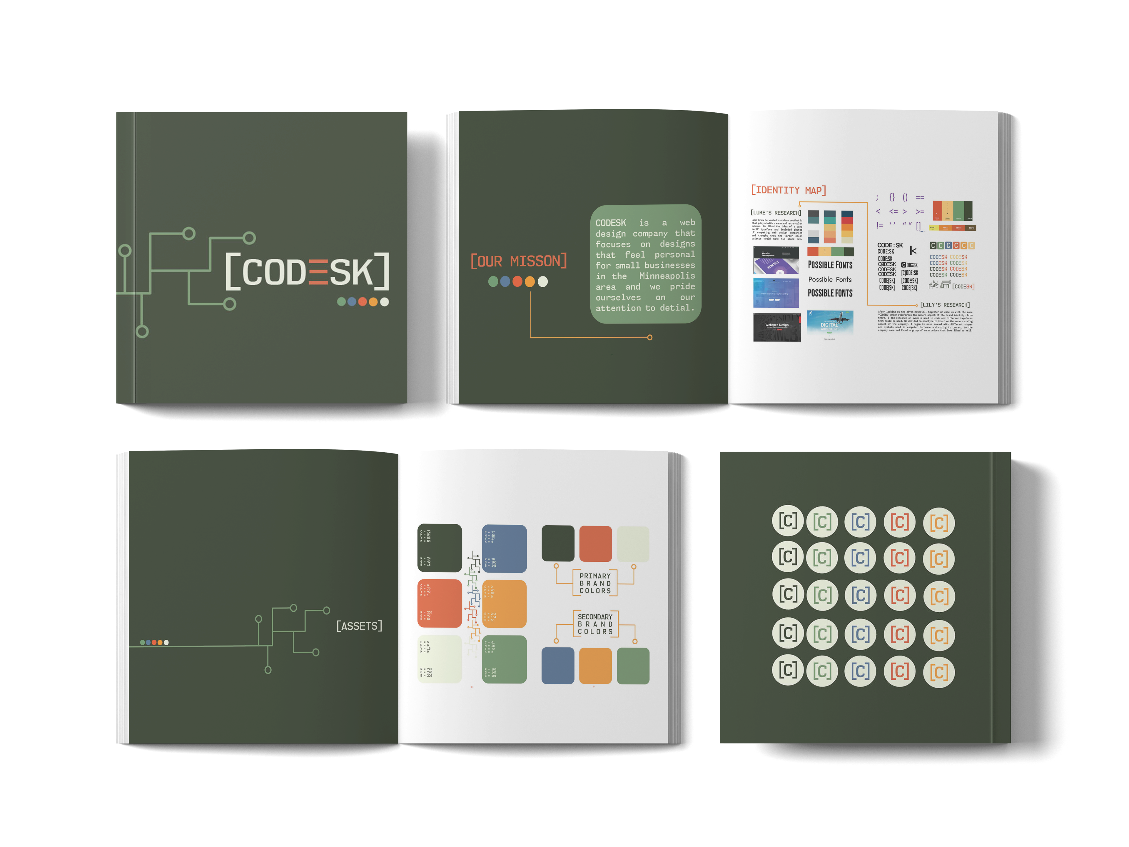
My Take: The client wanted CODESK’s aesthetic to be inviting and retro, so we chose a collection of muted, warm colors to achieve that feeling. The logo involves 3 lines to replicate an “E” to touch on the coding roots of web design and uses a monotype font that is commonly seen on old computer systems to highlight the retro aspect my client wanted. There are branching lines and brackets throughout the booklet to represent the complexity of computer boards since CODESK is primarily a company reliant on circuit board technology.
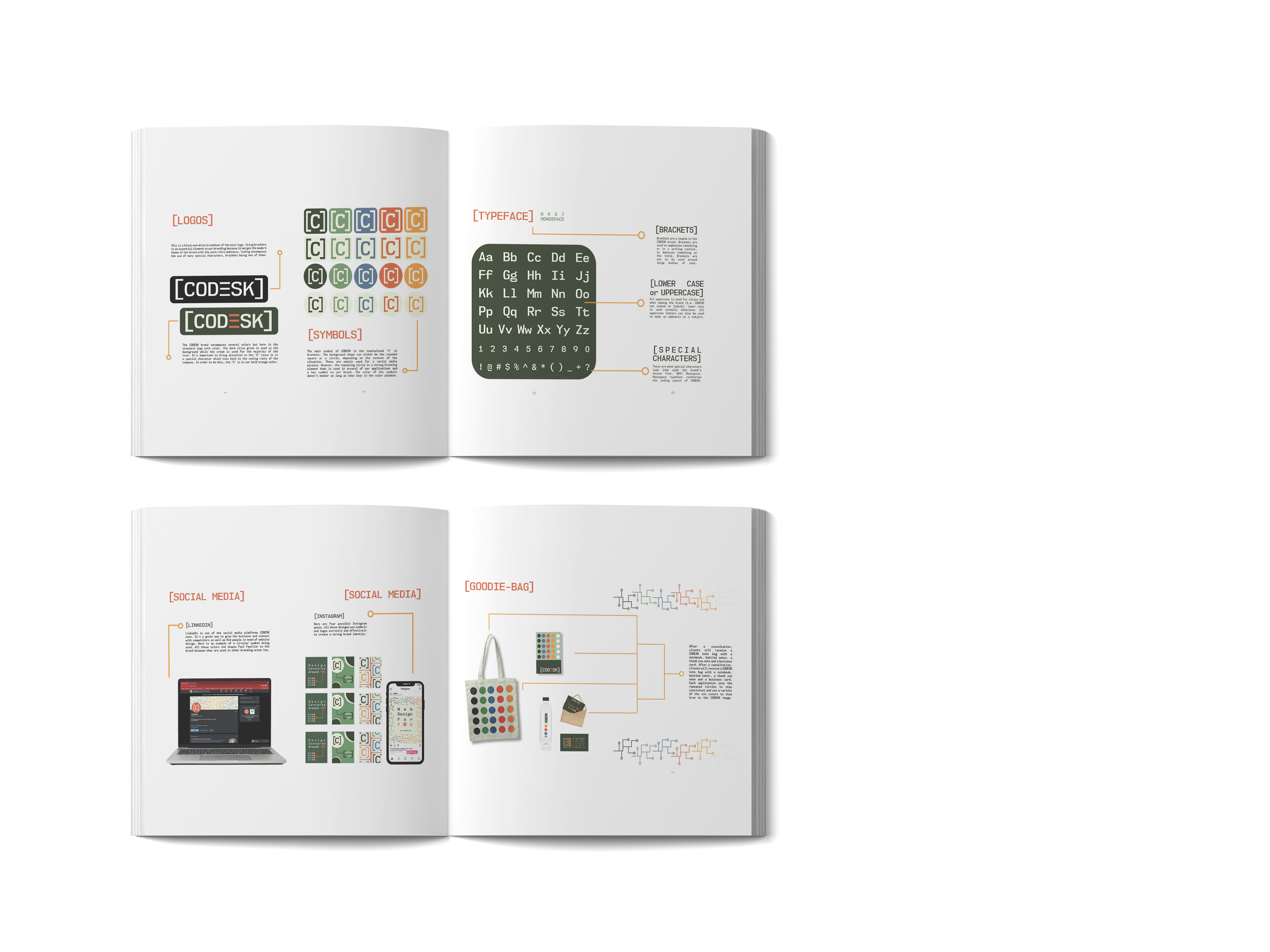
Additional pages of the booklet detailing CODESK branding.
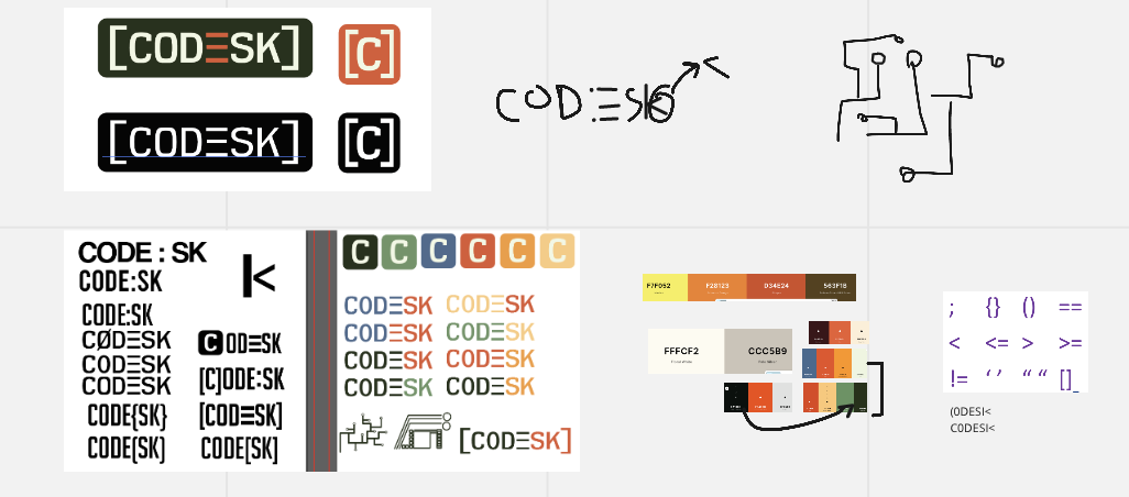
Preliminary sketches