Drake Mag | Summer 2024
Project Brief: Cover design for Drake Magazine
My Take: Using the bright blue and butter yellow colors to contrast the melancholy energy of the model to tease the reader of the topics discussed in the Drake Mag summer issue. I played with various typographies to create hierarchy and lead the reader's eye across the cover.
Project Brief: Table of contents design for Drake Magazine
My Take: A playful take on a TOC. Type on the left page is hand drawn.
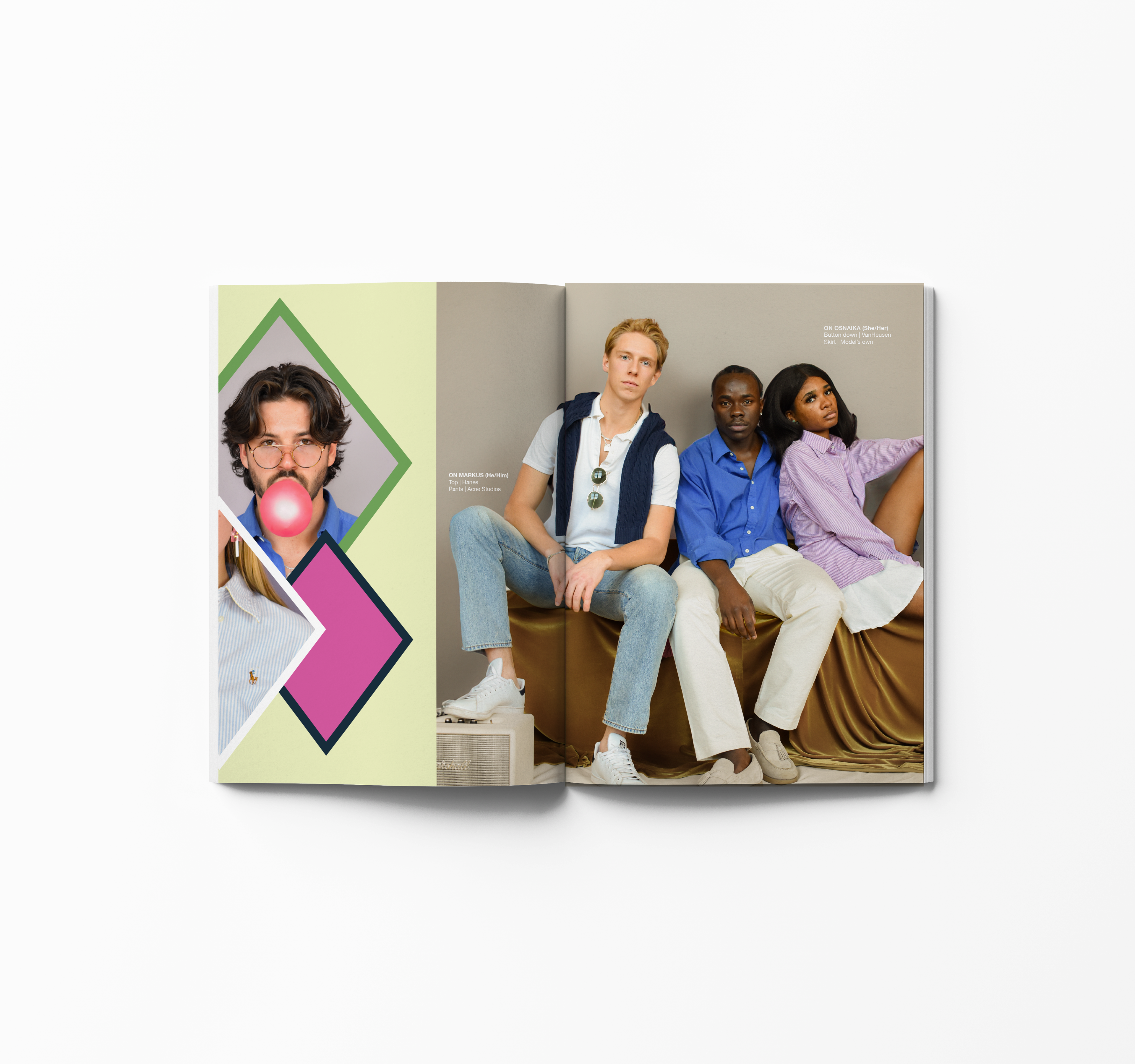
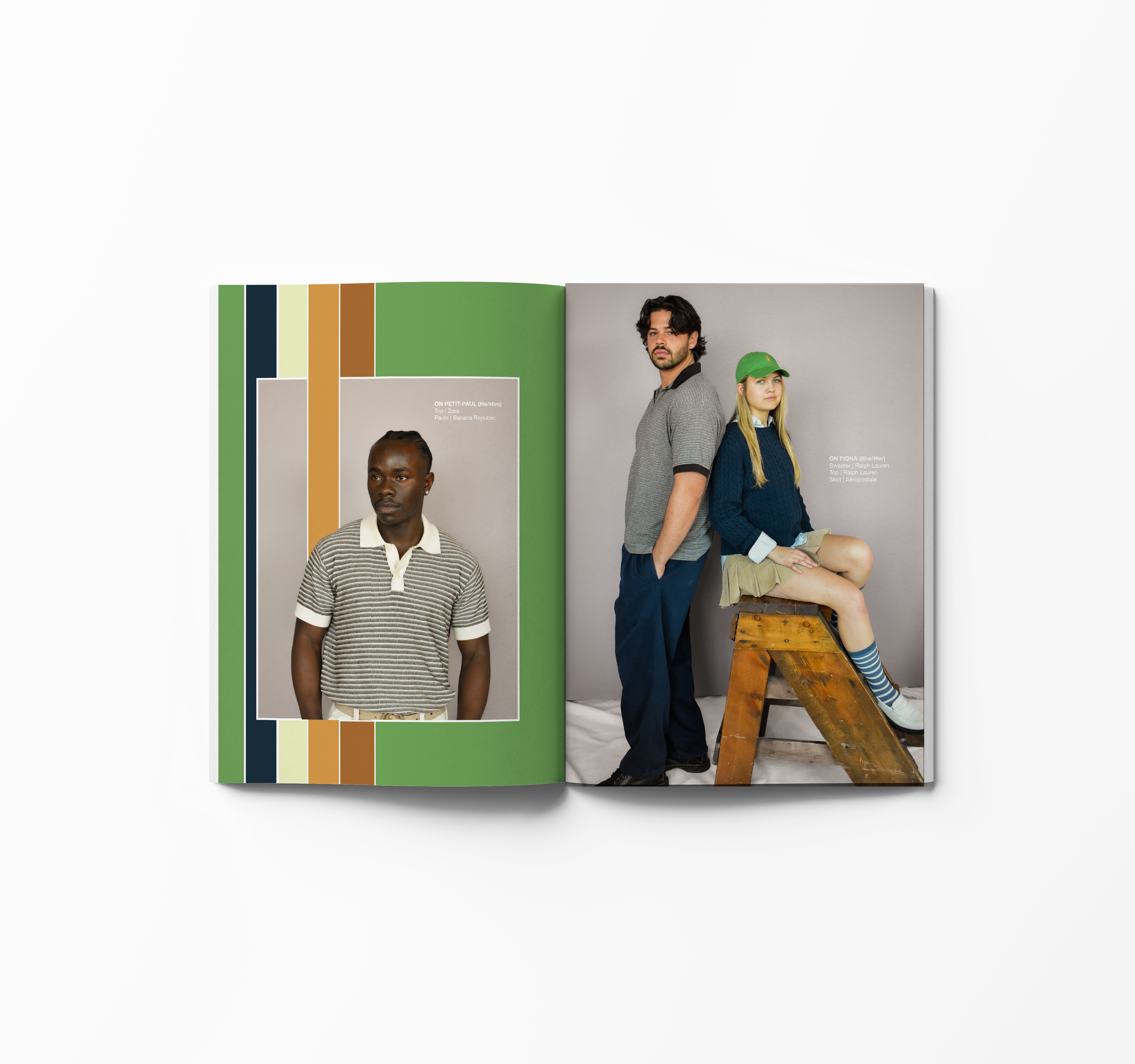
Project Brief: Collaborate with the fashion editor and photo editor to design a fashion feature about the return of “preppy” style.
My Take: With films like Saltburn and Challengers dominating the movie industry, I wanted to do my own take on classic fashion pieces. Vibrant colors that create visual tension were a priority while designing the spread to give the pages energy and movement while a reader flips through the magazine.
Drake Mag | Winter 2023
Project Brief: Design the cover and table of contents of Drake Magazine.
My Take: Using inspiration from the Taylor Swift Eras Tour, I designed a cover and table of contents that used vibrant colors to relate to the friendship bracelet trend that the concert sparked. Additional illustrative elements were included to add dimension to the cover and TOC.
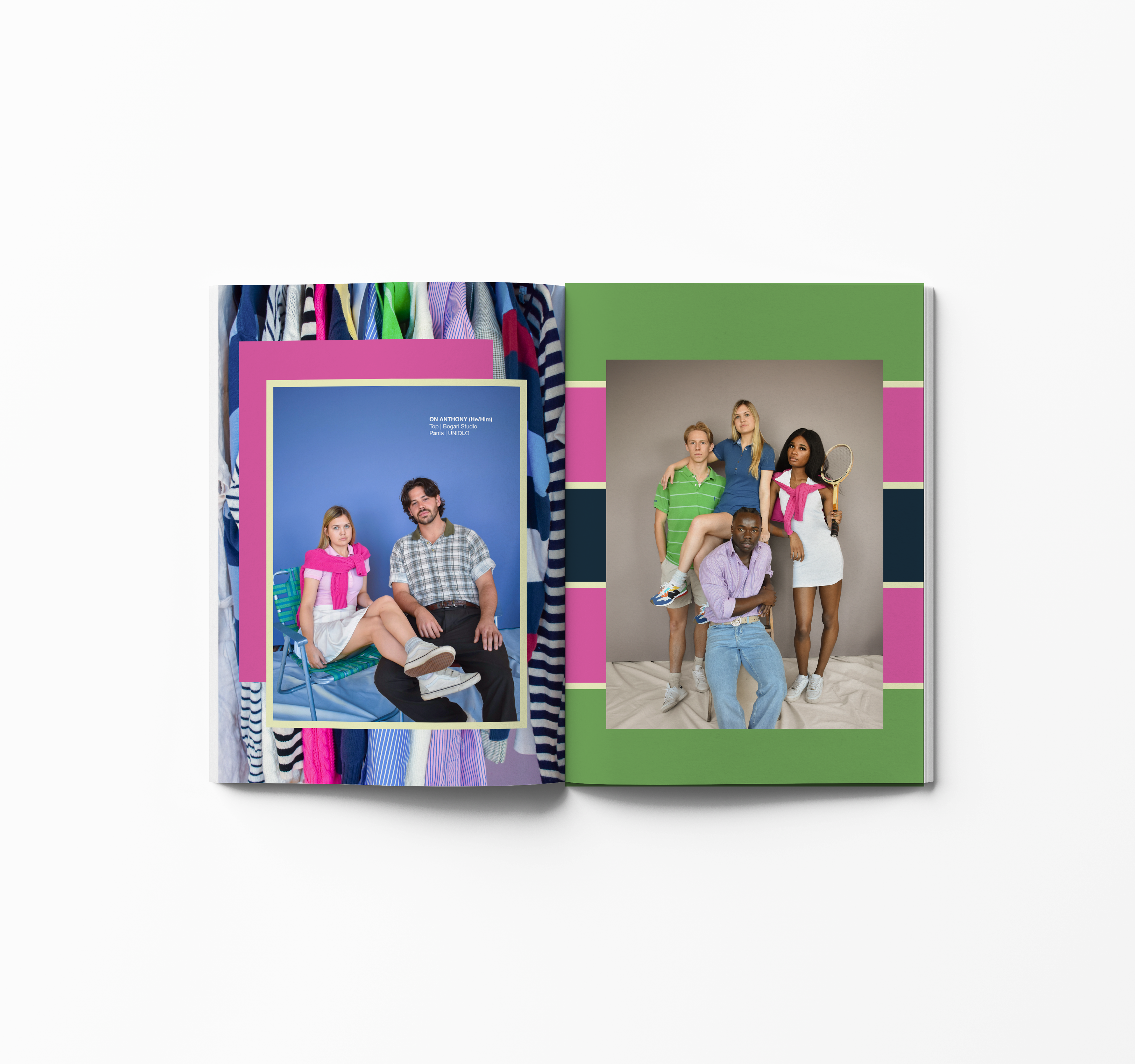
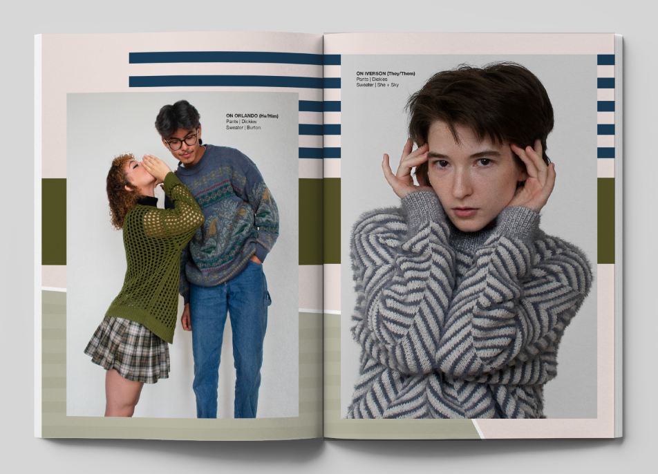
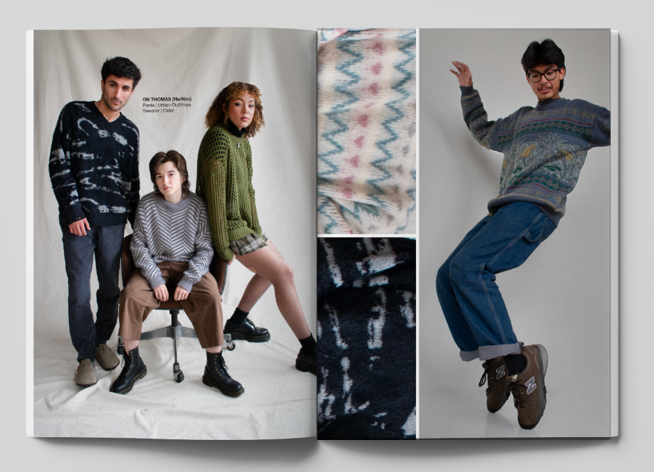
Project Brief: Collaborate with the fashion editor and photo editor to design a fashion feature about sweaters and knit fabrics.
My Take: Taking inspiration from the patterns and textures the models were wearing, I used color blocking and stripes to create background layers for the photos to lay on.

Drake Mag | Summer 2023
Project Brief: Design a one-page layout including six staff photos.
My Take: This layout was for the spring 2023 issue, so I took inspiration from a popular spring pattern, gingham. I arranged text and photos in a grid formation and added colors from the Drake Mag brand guidelines so it would keep the magazine cohesive.
Drake Mag | Winter 2022
Project Brief: Collaborate with writing staff, photography staff and Drake Mag Art Director to design unique spreads that still feel cohesive throughout the issue.
My Take: I played with scale and typography to fit four drink recipes. The black background is used to draw the reader in and contrast with the bright colors of the drinks.
