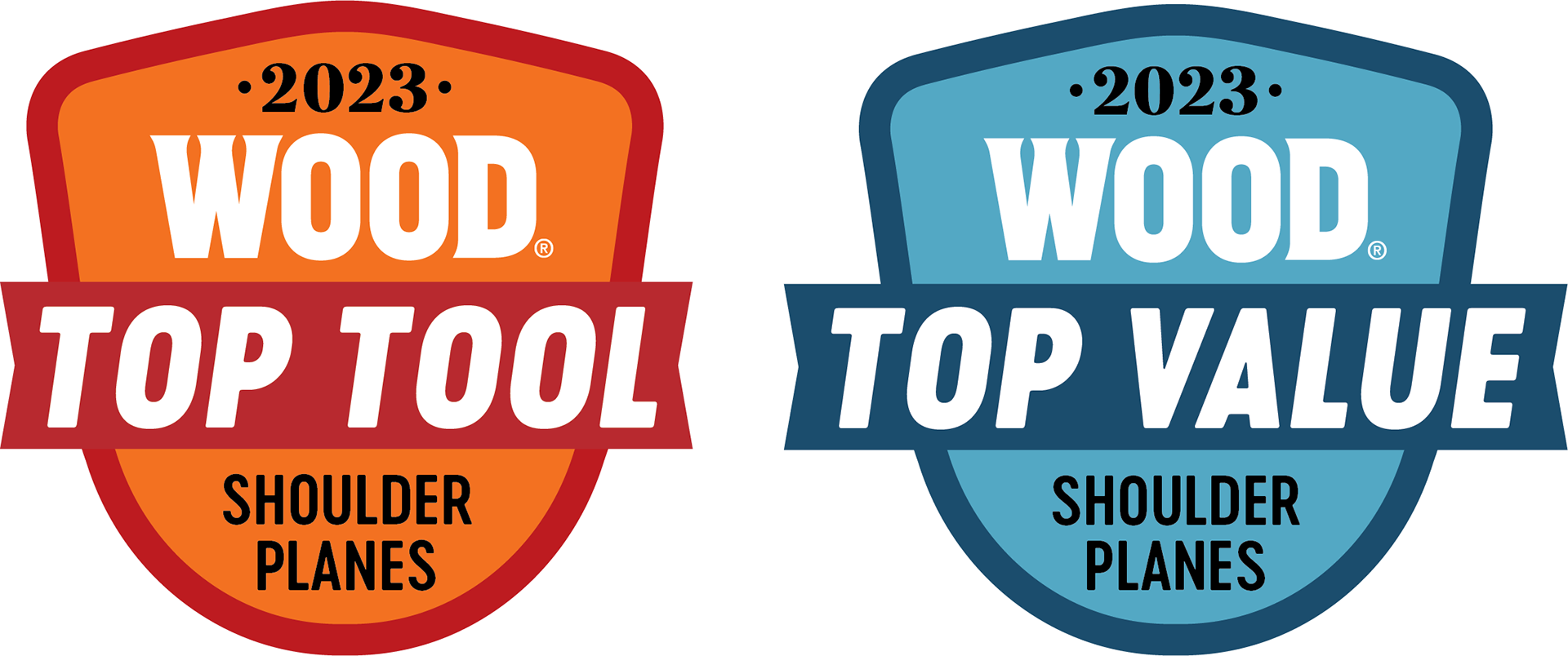
Project Brief: Design icons that will be placed next to highly ranked tools for WOOD Magazine.
My Take: WOOD Magazine has a target audience of 60+ year-old woodworkers. Taking that information into consideration, I wanted to use bright colors that are still within WOOD’s branding so they would catch the eye and I chose bold fonts that would be easier for an older audience to see.
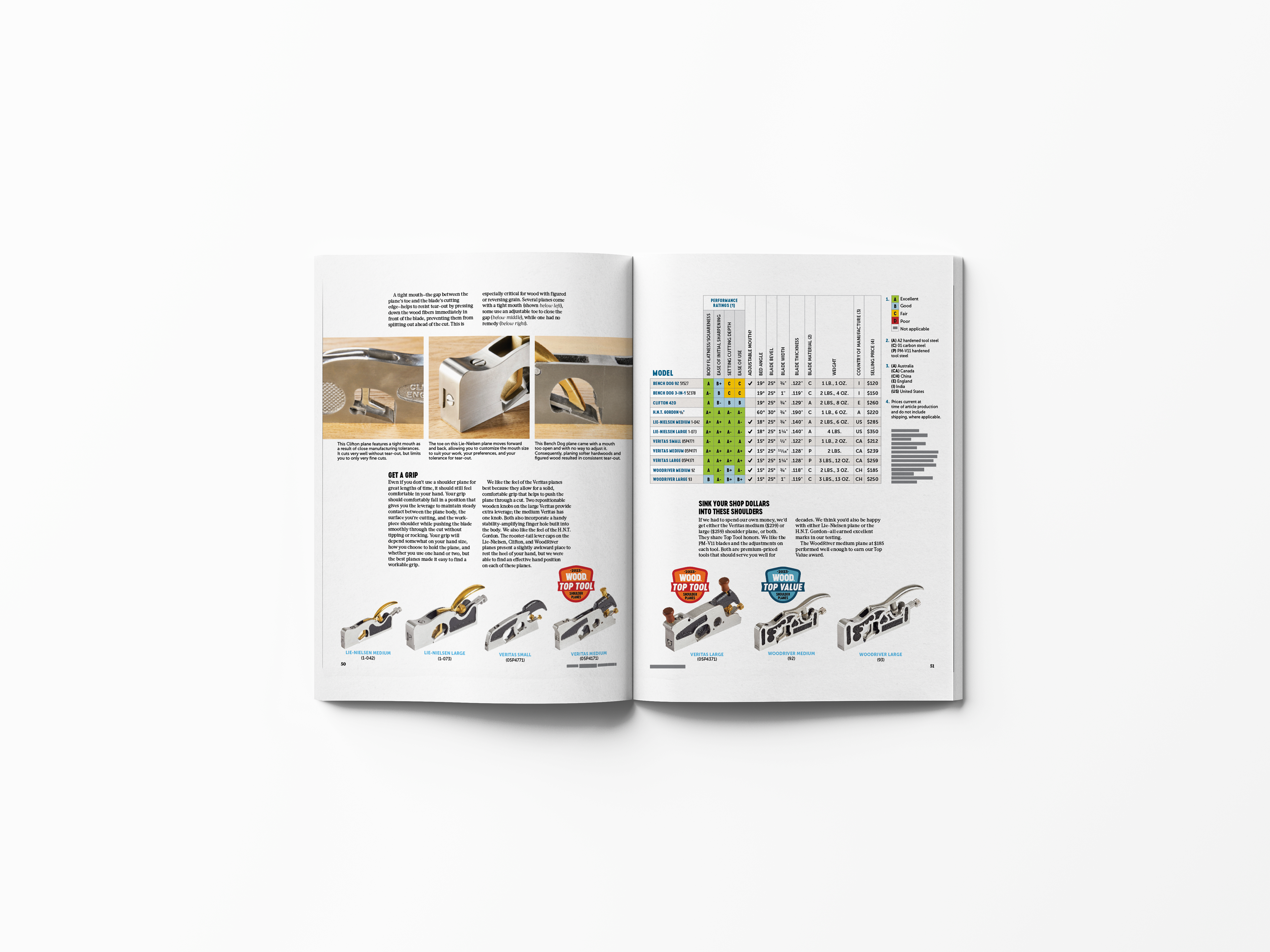
The icons used in a spread.
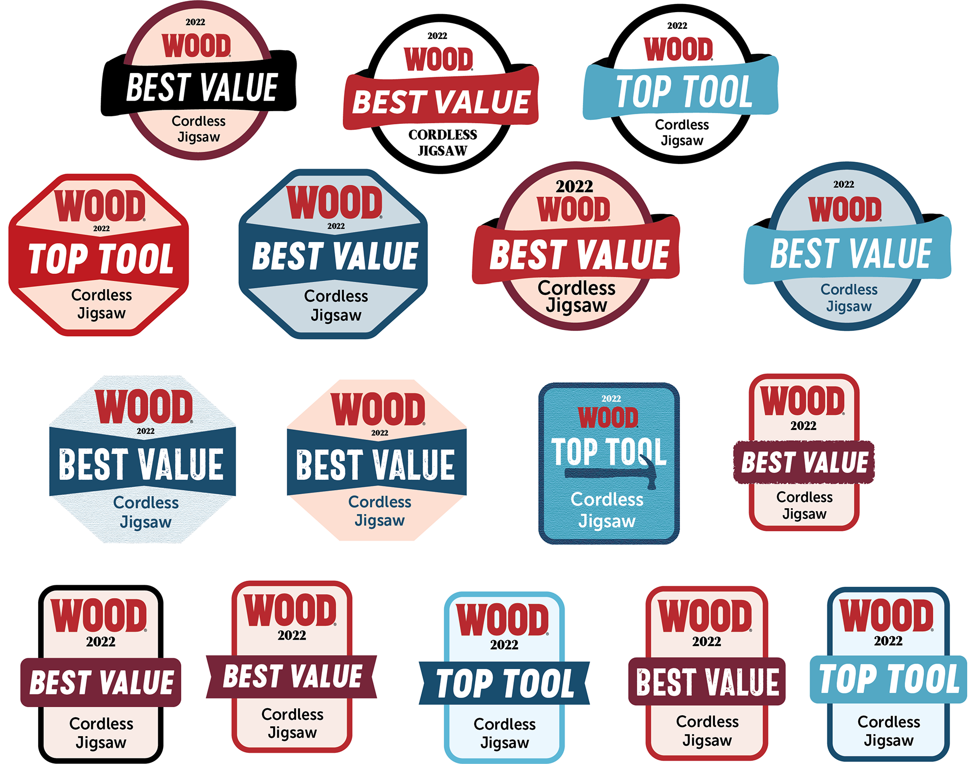
Preliminary iterations.
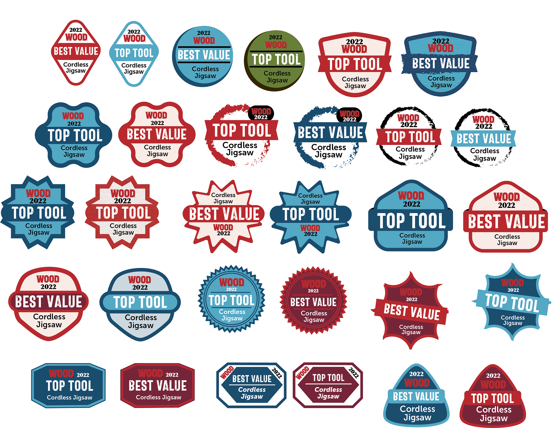
Preliminary iterations.